
Behind the Creators.org Logo
Creators.org is an organization with the mission to advance the rights of creators and foster a better internet for all. The initiative was born out of a profound need to recognize the emerging class of professional creators who are shaping the modern economy.
With over two million professional creators and countless others finding their livelihoods through distributed content, Creators.org stands as a beacon of unity and support for these talented individuals.
The Logo: A Deeper Dive
The Creators.org’s brand identity was designed by Alex Antolino (Founder & Creative Director at SubOne), and at its heart lies a simple yet thoughtfully designed logo.
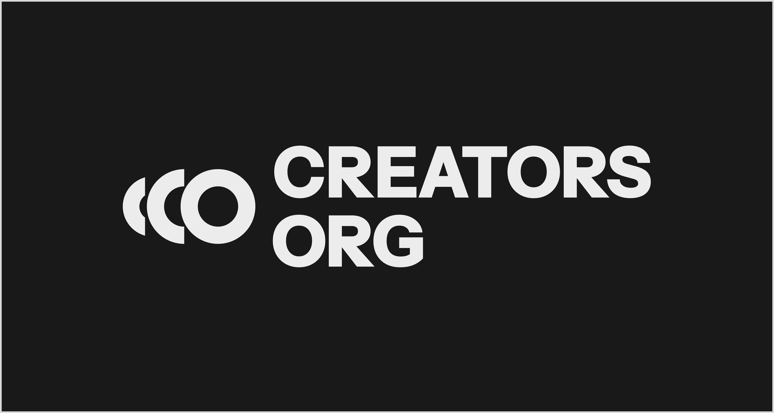
The mark is composed of two key elements, the letter "C" and "O". The "C" stands for "Creators," the lifeblood of the organization, while the "O" stands for "ORG," emphasizing the collective and organizational aspect of the platform.
Not only these are the two first letters of the brand’s name, but “CO” also means “common, mutual, joint”, which is the soul of the organization. But there’s more.

There's a third element—the "C" is accompanied by a smaller element resembling a "c." This subtle detail makes the mark unique and imparts a sense of movement and growth, symbolizing the journey of creators as they progress in their careers and shape the future.
Design Principles: Institutional with an Edge
The visual identity of Creators.org is designed to strike a balance between an institutional presence and an edgy, vibrant personality. The chosen typeface, Instrument Sans, offers functionality and elegant shapes, embodying neutrality and timelessness.
This neutrality allows the logo to act as a versatile umbrella, and the visual identity to take a secondary role, representing the unique personality of each creator it unites, and giving them spotlight.
The strategic use of bright colors for the typeface over neutral backgrounds infuses vitality and energy into the identity. It's a deliberate choice that brings back the creativity of the community, without overshadowing the individual creators.
Symbolism: Unity in Motion

Beyond the letters, the logo carries a deeper message of unity.
The three shapes within "cCO," can be interpreted as the silhouettes of three creators standing shoulder to shoulder, united in their pursuit of a common purpose.
It symbolizes collaboration, mutual support, and the strength that arises when creators come together to effect change.
A Brand for All Creators
Creators.org's logo and visual identity is an effort of simplicity and recognition. They are purposefully designed to be both memorable and adaptable, reflecting the brand's neutral yet distinctive personality.
As an early-stage brand, the visual identity is designed with an iterative approach in mind. It possesses the versatility to scale and evolve, just as the creators it represents continue to innovate and shape the future.
Starting to define the brand is just one more of the early milestones of a journey that has just begun.
Will you join?